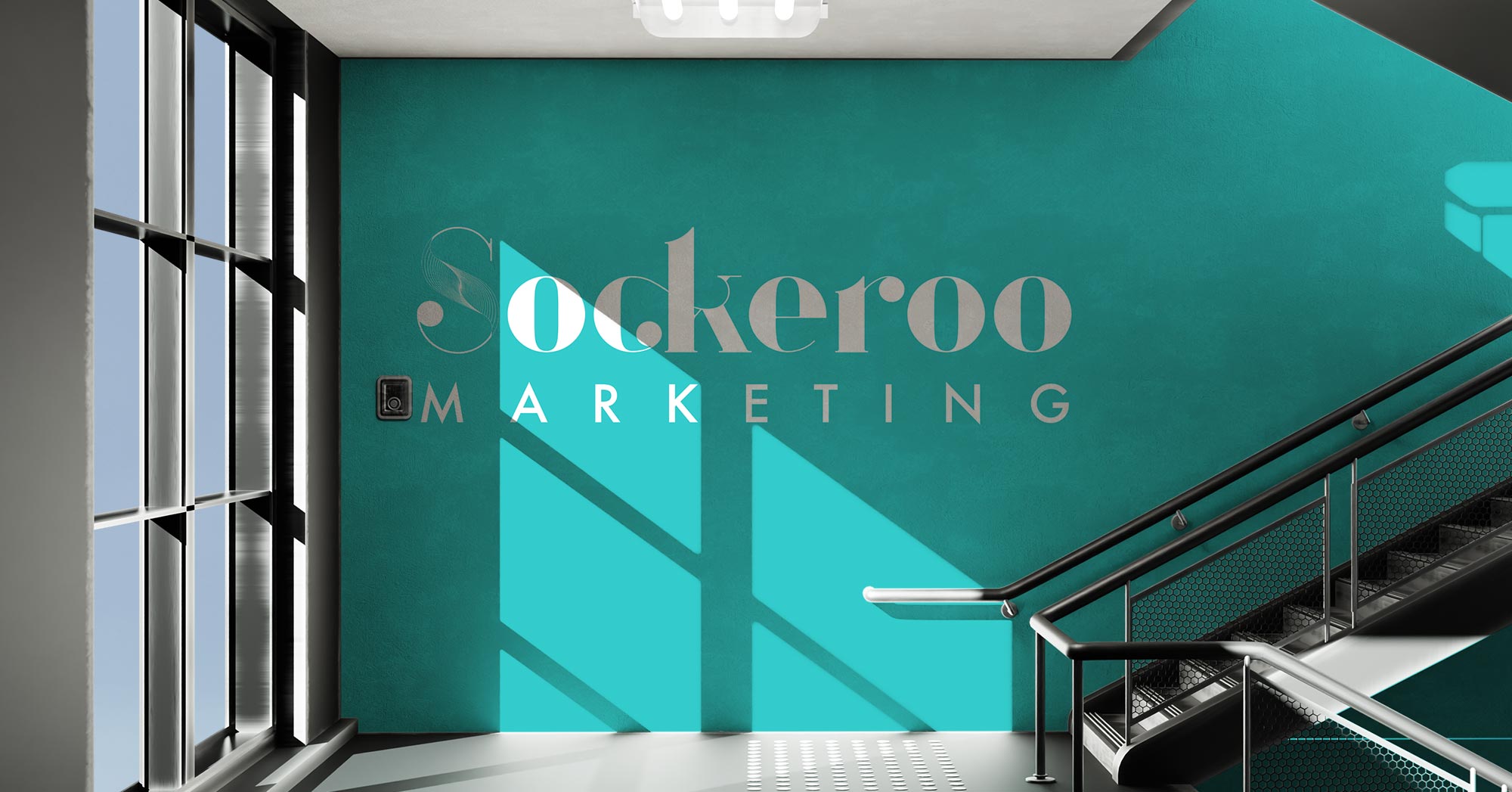
Sockeroo Marketing was created as a strategy-driven agency specializing in marketing execution, content development, and brand storytelling. The name “Sockeroo”—a 1940s slang term meaning a smash hit—inspired a brand identity with a subtle Art Deco influence that feels both timeless and approachable. To achieve this, I selected Argo as the primary typeface, originally designed as an Art Deco display font but with modern refinements, and paired it with Futura as a clean, versatile supporting font. Together, they established a bold yet sophisticated brand voice.
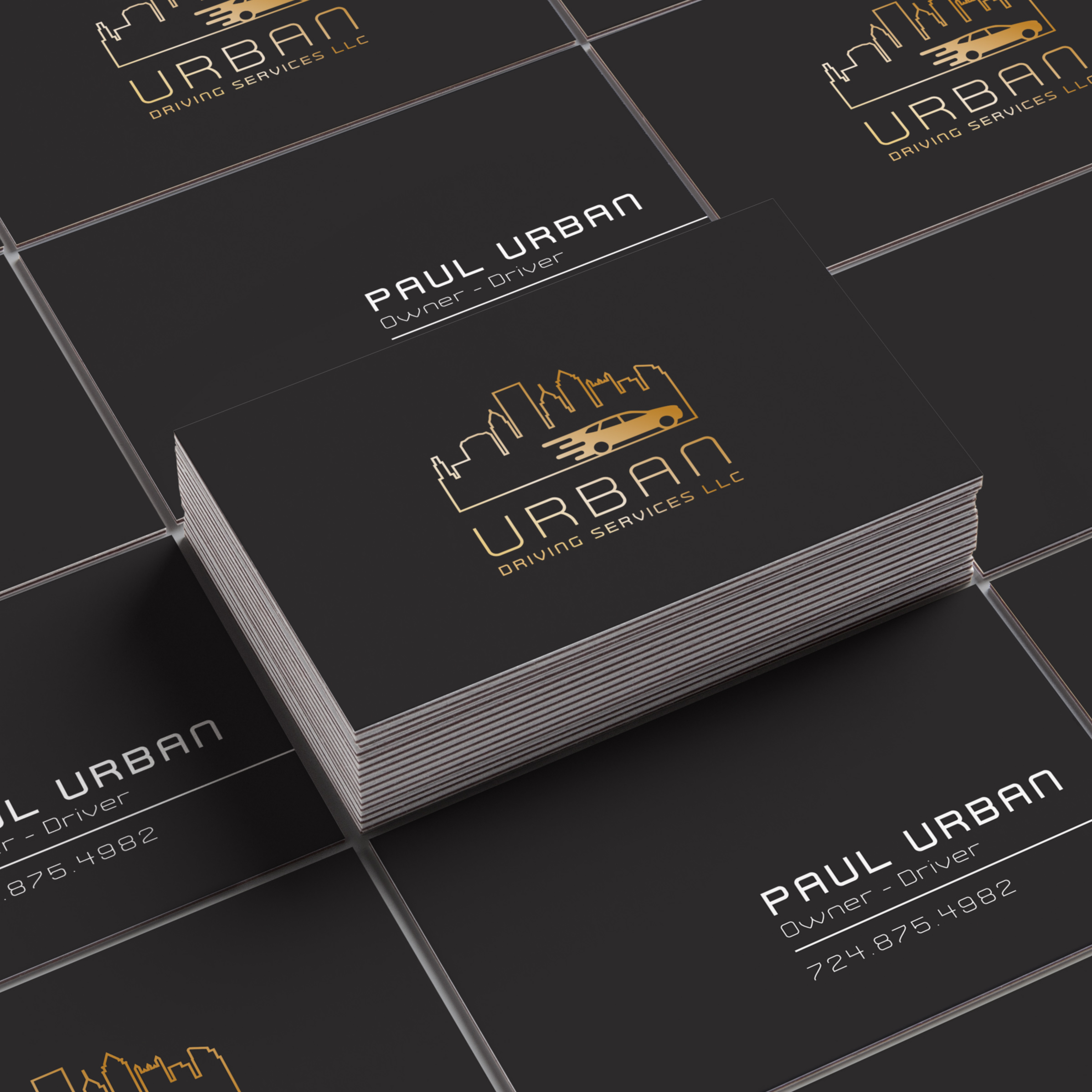
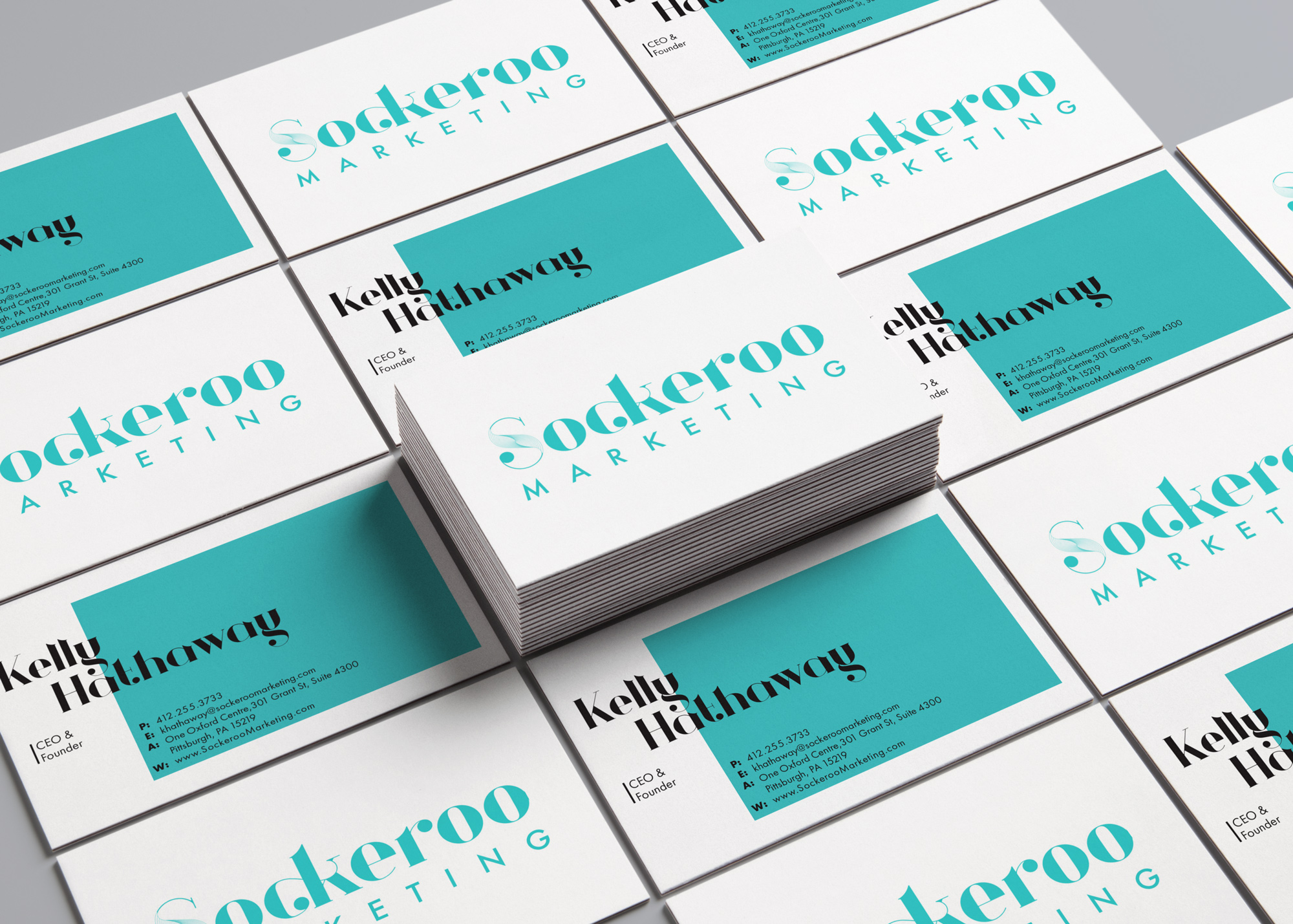
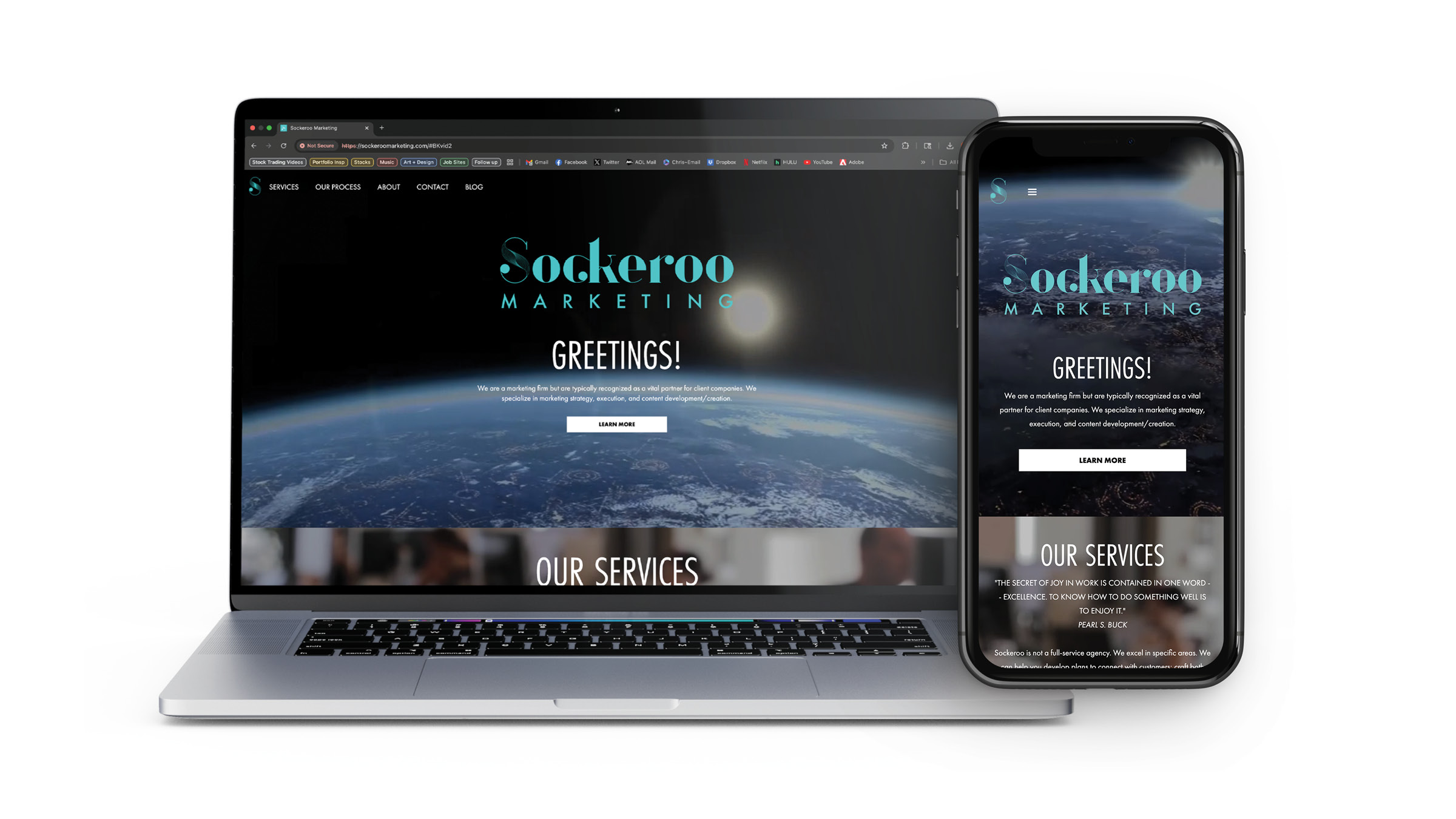
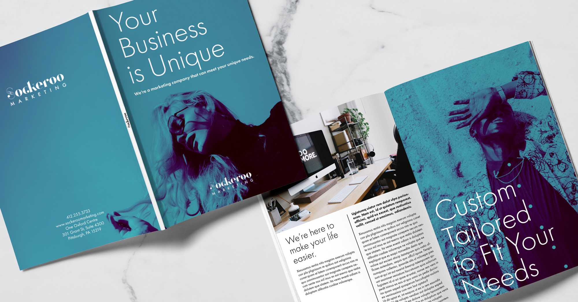
In addition to the identity system, I designed and developed the Sockeroo website and produced a variety of marketing materials to support advertising and outreach. The result was a cohesive, polished brand presence that reflects the company’s focus on creating “smash hit” marketing campaigns.
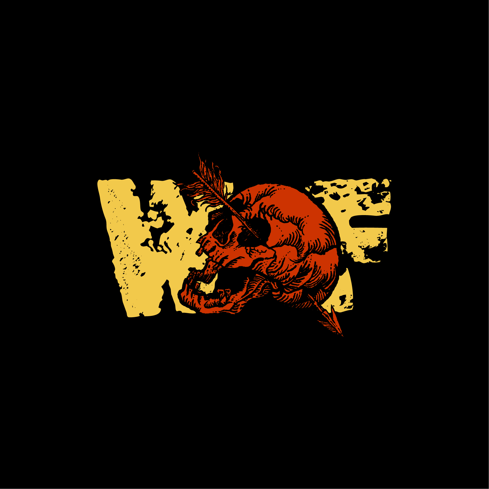
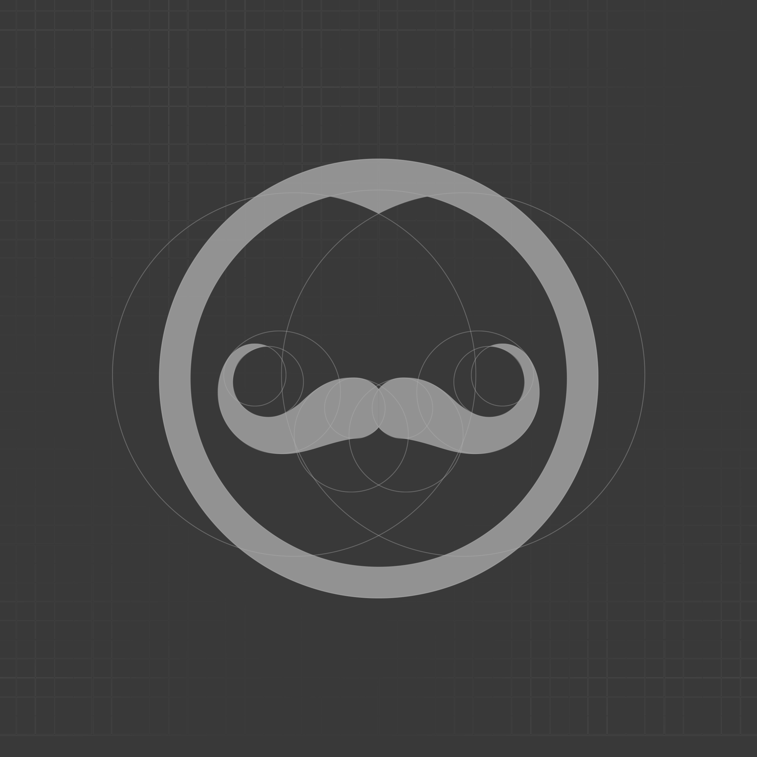
Below are 3 versions of the logo that didn't make the cut.



Below are two short YouTube commercial concepts I pitched with stock footage. While they were not ultimately produced, they showcase the creative direction and storytelling approach behind the campaign.
I also created the logo animation at the end.


